Now that you have
planned out your dashboard and
built out your first few pages, it’s time to start adding some interactive features to your dashboard. Google Data Studio has a few features that allow your users to filter and segment the data, allowing them to easily find the information they need in one place. Here are some of the features I use most frequently with step-by-step instructions to implement them on your reports.
1: Date Controls
Date controls are the easiest way to make your report interactive. They allow users to select the date range for the report. By default, when you add a Date Control, it applies only to the current page. If you add a control to each page individually, the user will have to update the dates on each page they view.
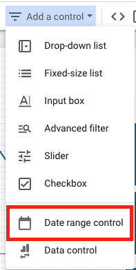
To add a Date Control, click “Add a control” and select “Date range control.”
When you make the Control “Report-Level,” it will appear in the same place on every page, and the range will update automatically on every page for the user.
To make your Date Control “Report-Level,” simply place it on any page of your report, then right-click and select “make report-level.”
2: Dropdown Menus
You can create a dropdown menu from any dimension available in your data source, or you can create a custom menu using regular expressions (more on this later).
For example, if you are using an Analytics Data Source, you can create a dropdown using the “Source” dimension. This would allow users to filter the data on your report by users that had a source of Social, Google, or Zillow.
To add a dropdown menu, click “add a control” and select “drop-down list.”
Under “Control Field,” you will want to select the dimension that you wish to filter your data by.
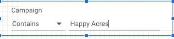
Filters allow users to search and filter the data shown on the report. I find this useful if there are too many options to use in a dropdown menu. For example, you can add an advanced filter that allows users to search for specific campaigns, or groups of campaigns, on a Google Ads report. You can create an advanced filter for any dimension within your Data Source.
To add an advanced filter, click on “Add a control” then select “Advanced filter.”
Next, select the dimension you want to use as your filter as the “Control Field.”
Your Control will now filter all of the charts with the same data source on the page.
 4- Optional Metrics
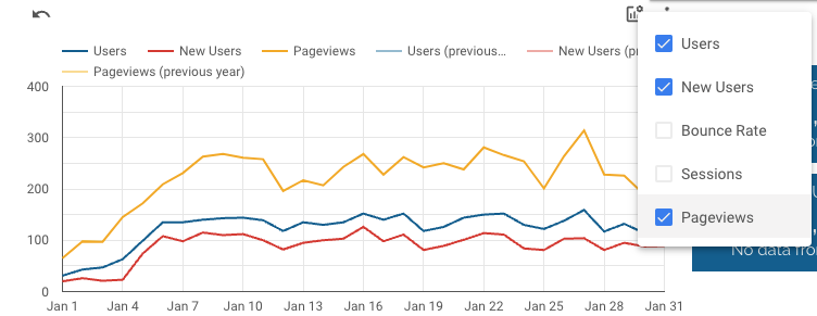
The optional metric feature is a great way to keep your reports clean and simple. This allows you to hide specific metrics from the default chart view, which can be added by the user as needed. For example, you want to show Users, New Users, Bounce Rate, Sessions, and Pageviews over time. If you add all of these to a chart as metrics, your chart will look something like this:
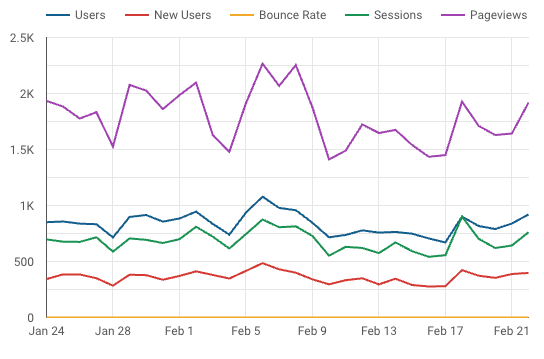
Too many metrics on one chart at one time can be distracting and difficult to read. Adding Optional Metrics allows users to toggle the data they need on and off.
4: Optional Metrics
To Add Optional Metrics, click on the chart that you would like to add optional metrics to.
Under “Metric,” toggle ON “Optional metrics.”
Next, select the metrics you would like to add to the chart.
Now when you hover over your chart, you will see this icon. When you click on it, a dropdown will appear to add/remove your optional metrics.
Hopefully, these tips and steps will help you take your Data Studio reports to the next level.