

Are you ready to simplify the management of your dashboards and impress everyone at your builder with your brilliant data? Then, it’s time for you to build your first report with Google Data Studio. Excel is a great tool for analysis but not so ideal for maintaining dashboards. There is nothing worse than having to drop everything in the middle of a big project to update charts at the last minute before an unexpected meeting.
Google’s free tool, Data Studio, removes that headache by importing data directly from the source and regularly feeding it into a report. You can easily download this report to hand off to the team, or you can share it so it’s available live, at any moment.
Like any new software, it can be a little intimidating to get started. In this post, I will walk you through setting up your first report.
Before we get started, it is critical that you have a plan in place and know what questions you need this report to answer. If you need help with this part, check out my post on planning a dashboard.
First, let’s take a look at some of the terminology you’ll need to understand when working in Data Studio:
Data Source: Before you can create your report you need to connect a data source. You are able to use multiple data sources on a report.
Dimension and Metric: All charts need to have a Dimension and a Metric associated with them. When determining what these should be, think of the question you want this chart to answer. Let’s look at a few common ones.
You do have the ability to use multiple dimensions and metrics within a single chart.
Chart: Essentially every element on a data studio report is called a chart. These include tables, scorecards, line graphs, and maps.
Filter: You are able to filter reports or individual charts.
Control: This is an element you can add that allows users of your report to engage with it and filter the data in real-time. The easiest control to use is the Date Control, which allows the user to change the date parameter of the report as needed.
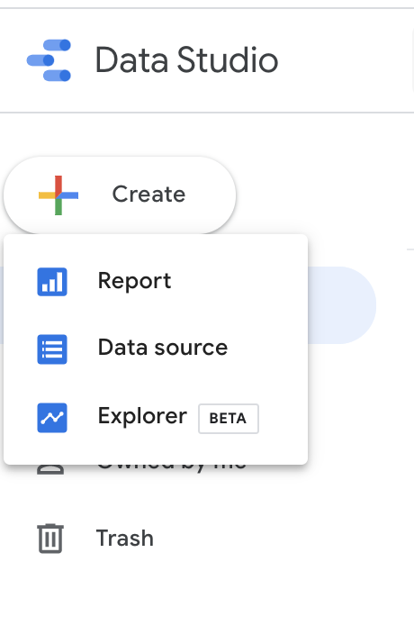
Click the +Create button to the left of your screen, then select “Data Source” from the dropdown.
 Select your Connector to pull in your data. We are going to start with Google Analytics here. There are connectors for a variety of data sources, including Google ads, Facebook Ads, and Call Rail; although some connectors do require a cost to subscribe.

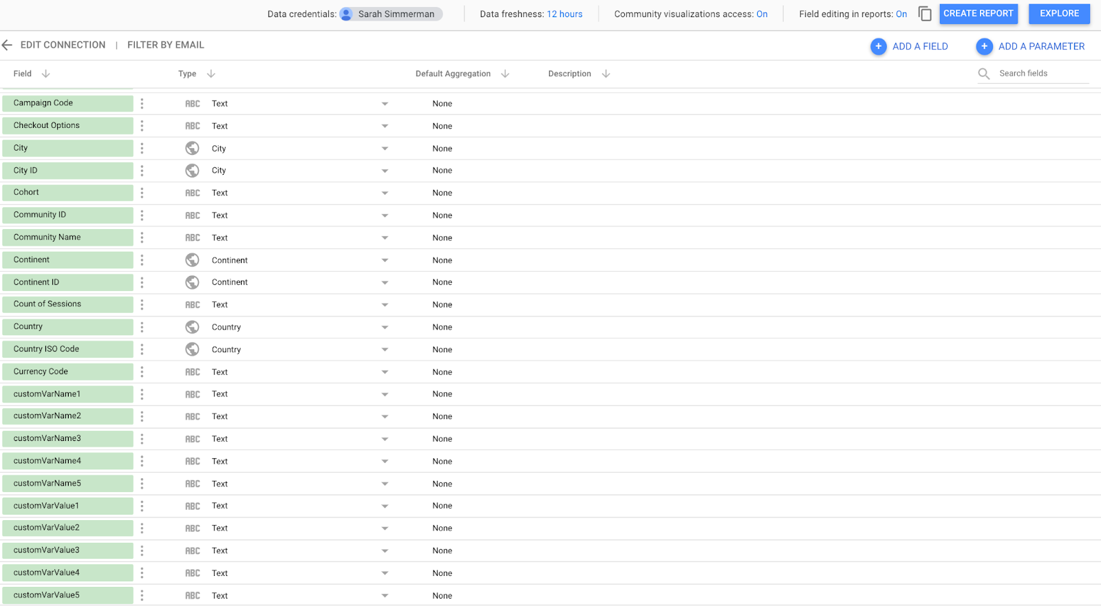
Select the correct Account, Property, and View; then click connect.

This will bring you to a screen that shows how the fields are mapped out. Now you can click “Create Report” to start on your dashboard!
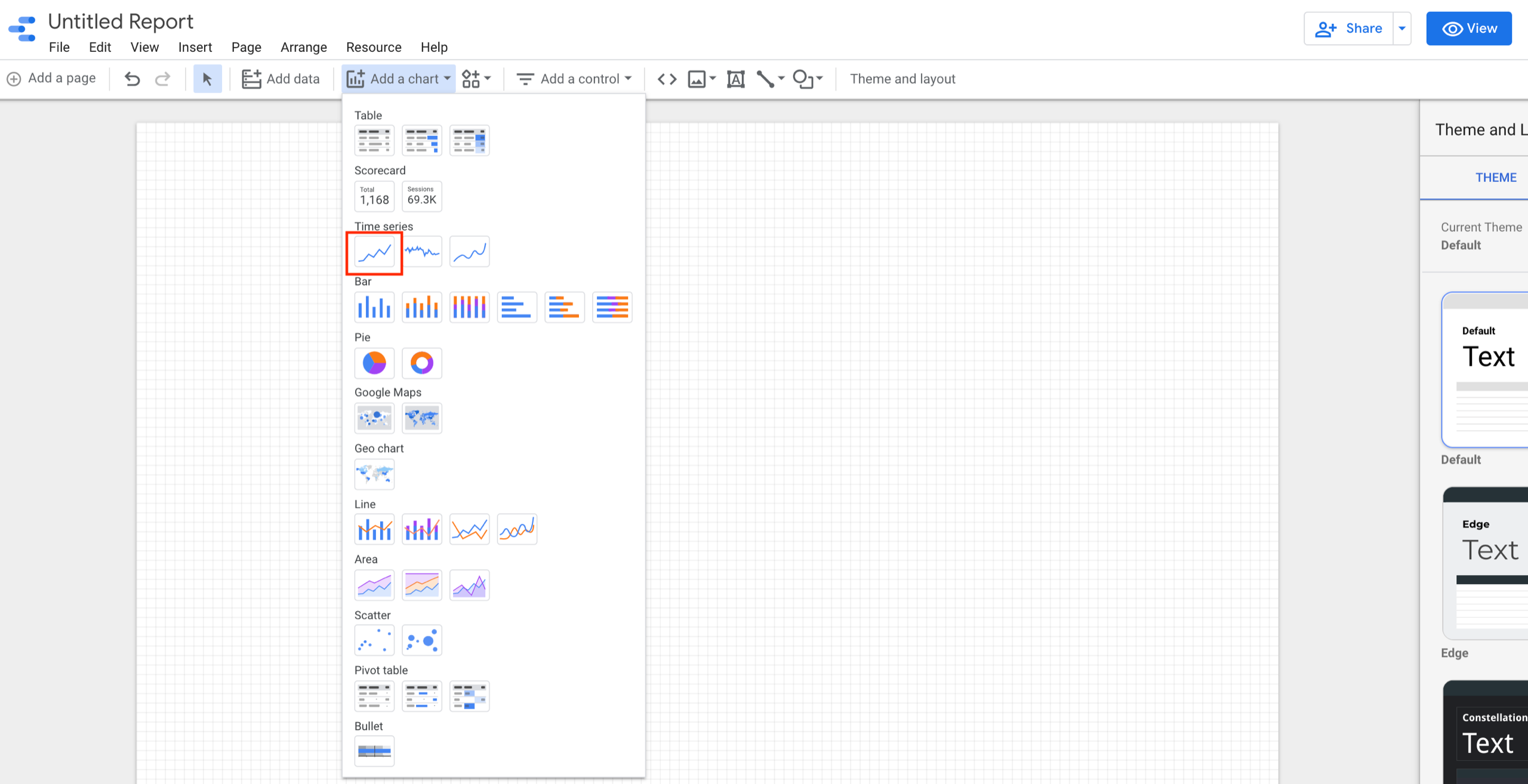
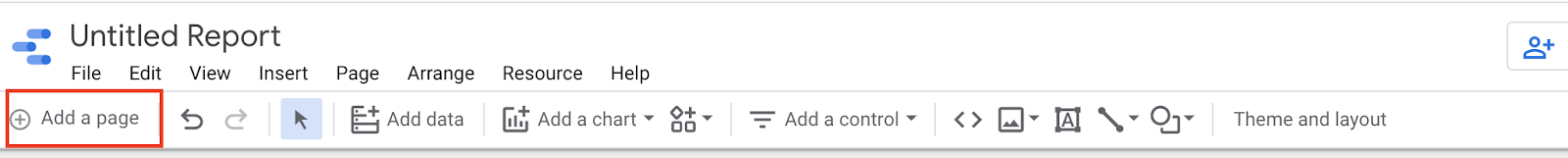
Now you should have a blank dashboard open. Let’s add our first chart. I want to show how many users come to our site on a daily basis.
Let’s choose “Time Series” from the Chart dropdown menu.
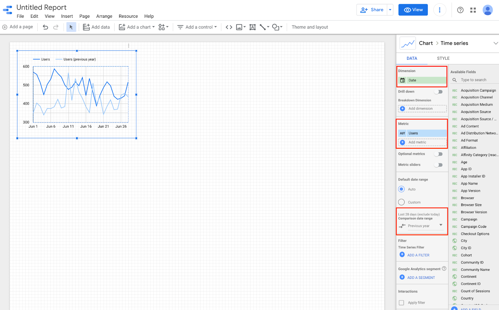
Next, select Date as your dimension and Users as the metric. For time series charts, you can also select a comparison range. Here, I selected a comparison period of the previous year. In most cases, you will want to show a comparison, and comparing the previous year is ideal since it removes seasonality from the equation.
You can continue to add charts using the same method.
Additional Pages: If you want to cover more than what will fit on a single page, Data Studio has the capability to add additional pages. Generally, try to keep each page to one general topic. For example, you can have Facebook Ads on one page, and Google Ads on another.
Allowing Interaction with Your Report: You can add controls if you want your users to be able to interact with your report. Let’s look at adding a date control.
Click on the “Add Control” Button in the menu bar. Choose “Date Range Control” in the dropdown.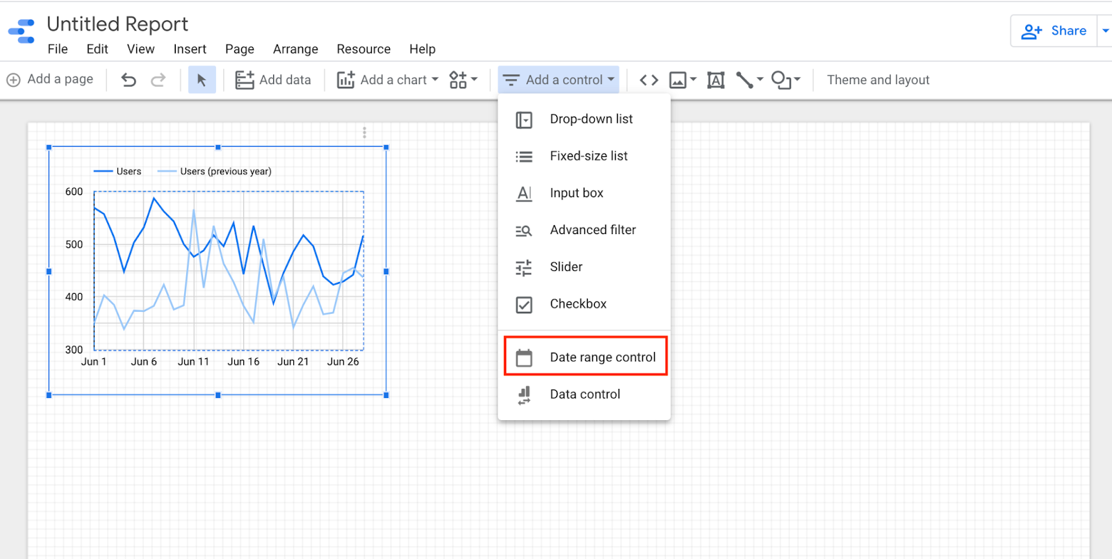
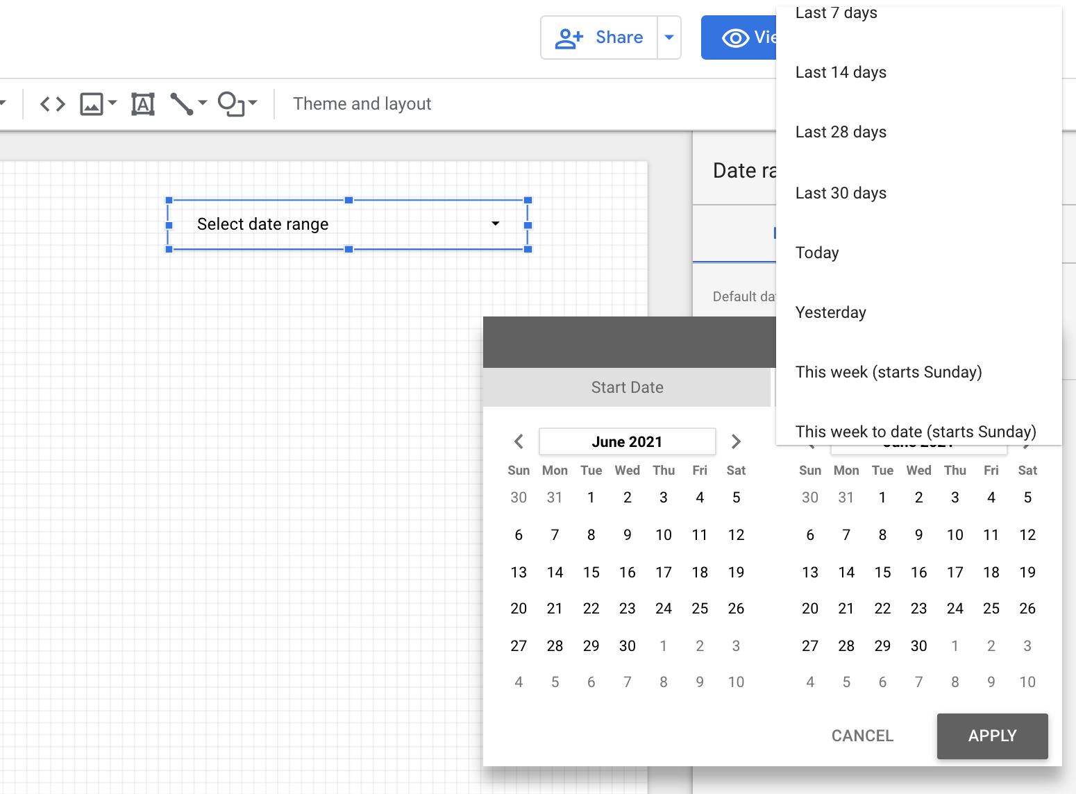
Now place the control on the page, and set your default date range. I like to start with a rolling 30 days, knowing that users will be able to customize the dates.
One important note to remember, by default the control will affect all of the charts on the current page. You can make the control affect all pages of your report by right-clicking, then selecting “make report level.” 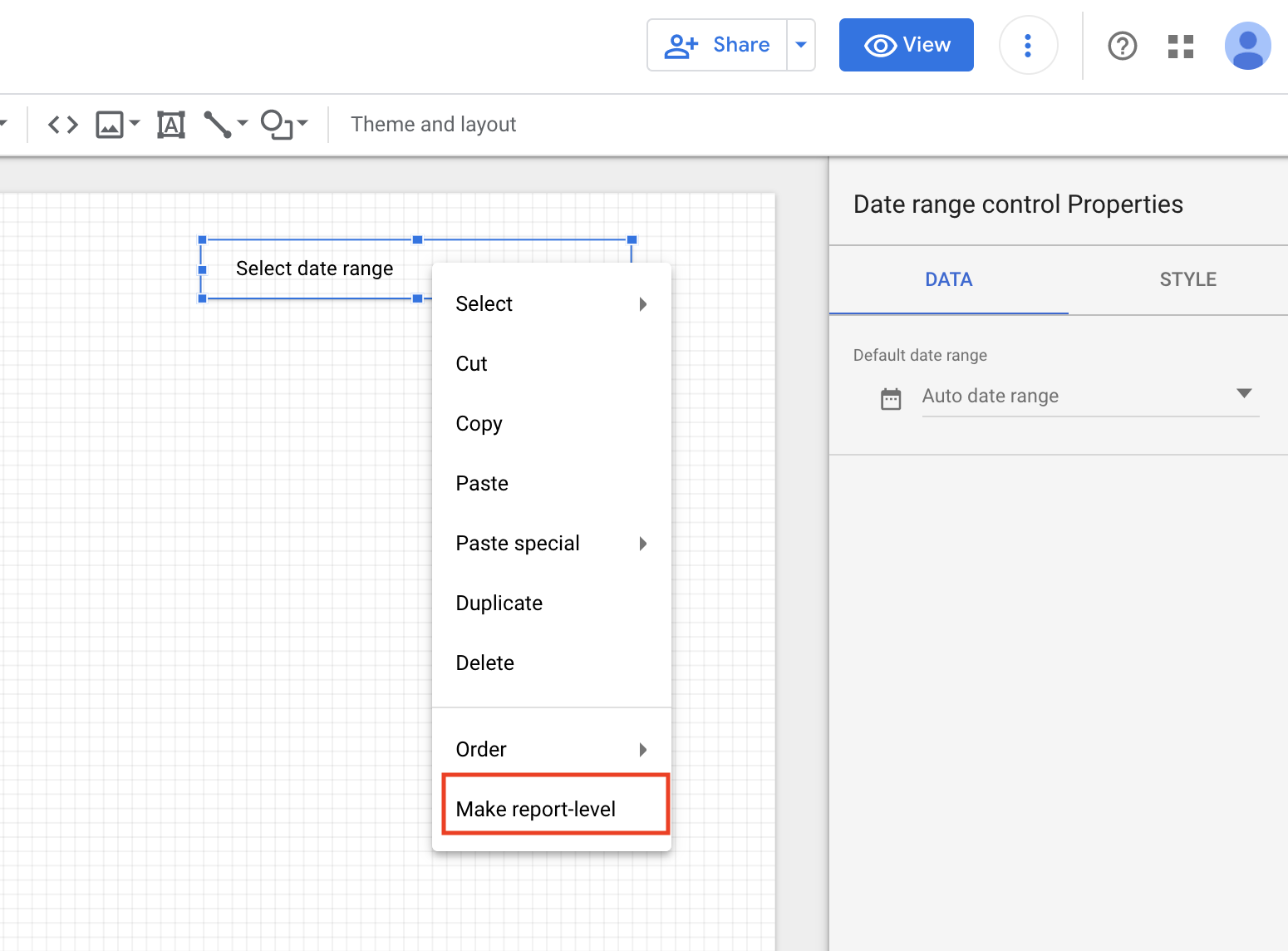
Now that you understand the basic workings of Data Studio, you are ready to start adding additional data sources and charts to display the metrics that matter most to your builder. While the setup may seem tedious, it will save you countless hours over the long run (as well as make you look like a rockstar).
For additional data studio resources and considerations check out our previous posts:
6 QUESTIONS TO ASK WHEN BUILDING A MARKETING DASHBOARD
GOOGLE DATA STUDIO FOR HOME BUILDERS – AN INTRODUCTION
DIGITAL PRIORITIES FOR NEW HOME BUILDER MARKETERS
The post Mastering Google Data Studio One Step at a Time appeared first on Online Sales and Marketing for Home Builders - DYC.


