
Humans are visual creatures. We instinctively form first impressions within seconds and since most of the information we consume and interpret online is visual, quality photos of your product can make your site. And vice versa with sub-par images.
A picture is worth a thousand words. If you want your brand to stick in the viewer’s mind as professional and credible, the photos you upload need to convey the same message. What we see is what we get right? Apart from adding in landscaping or interior decor, an effective image will help transcend your written descriptions and allow the viewer to feel the quality of what you have to offer (or better yet, help guide them to taking action!).
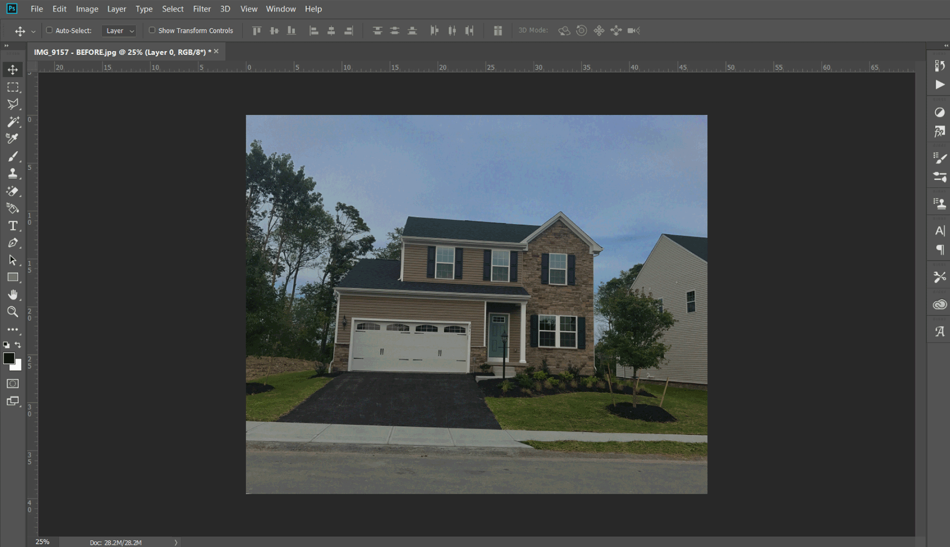
Below are a few quick photo fix tips using Photoshop (Creative Cloud 2018) to help you transform the handful of those mediocre images to ones worth sharing. Remember, the last thing you want is to portray a poor representation of your product.
Place a guide:
Adding guides to your Photoshop document are a great way of making sure everything’s aligned nicely – both horizontally or vertically. Using this method, you can easily add a guide to where the house is positioned horizontally to get an idea if it needs realigned.
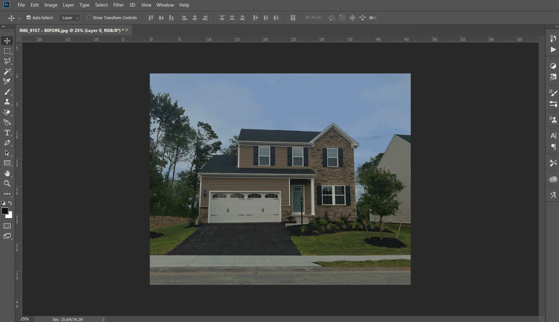
Use the Crop Tool to straight and crop an image:
*To remove a single guide, switch back to the Move Tool (![]() ) and drag the guide outside the image window.
) and drag the guide outside the image window.
The Shadows/Highlights adjustment is a great feature that offers a quick and easy method of correcting over- and underexposed areas. This command works well on a subject photographed with in bright, slightly washed out overhead light or in light coming from behind (known as backlighting). The adjustment can also bring out the detail in harsh shadow areas.
When the dialog box appears, the default correction is applied automatically in your preview.
Your goal is to reveal more detail in the dark and light areas of your image. If, after you do so, your image still looks like it needs more correction, add or delete contrast in your midtone areas. If only part of your image needs correcting, you can select just that portion before applying the adjustment.
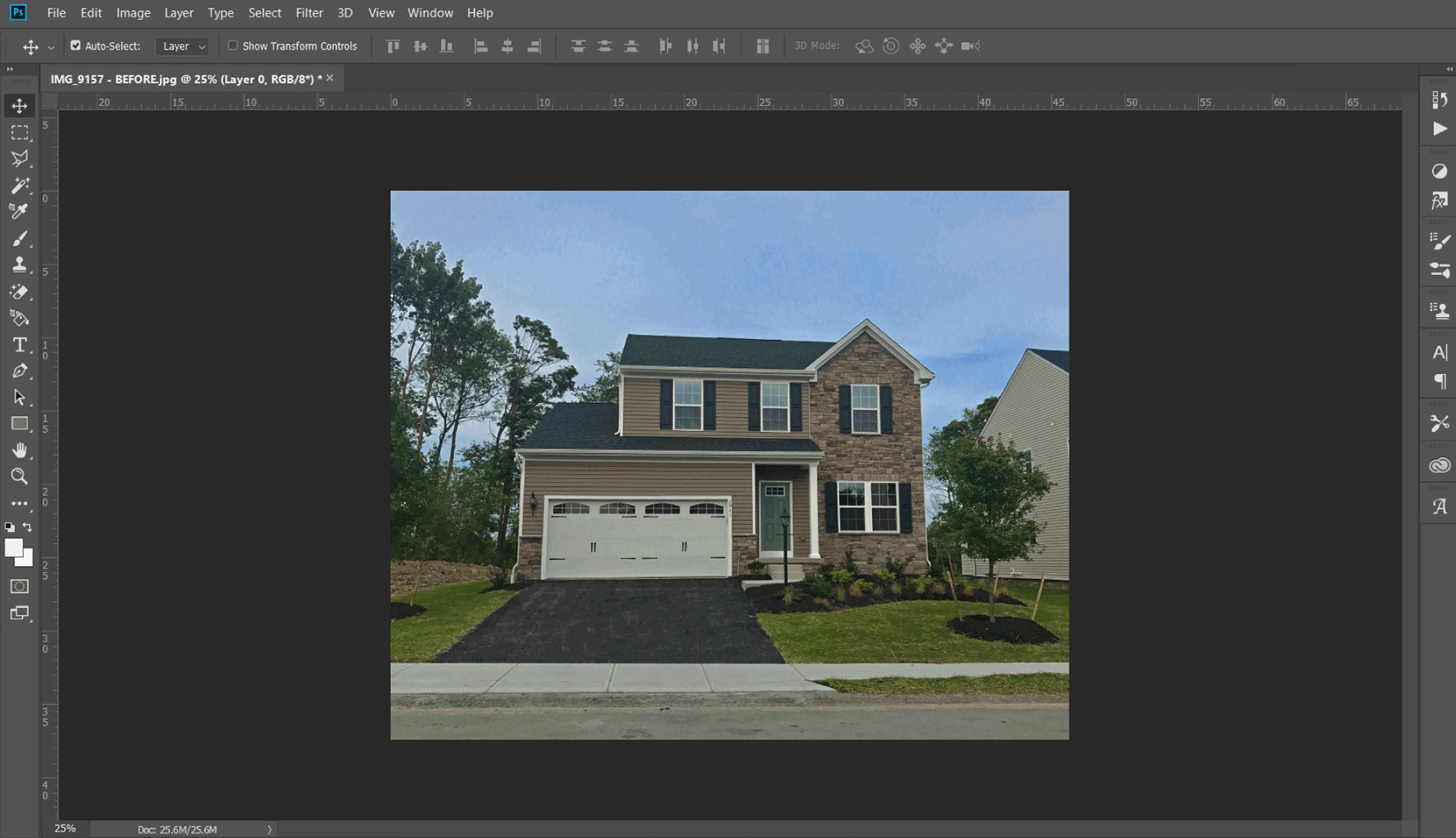
The Vibrance adjustment cleverly alters the saturation of more muted colors and leaves the already well-saturated colors alone. It’s sort of
like fill light, but for colors. When you drag it to the right, this smart-tool only makes dull colors in the image more vibrant and colorful. An overcast sky or dull lawn would be perfect to help fix. Due to its special mathematical algorithm, it avoids skin tones from becoming oversaturated.
It’s always worth an extra few minutes to make sure you’re putting your best foot forward. Look for more helpful design tips in the weeks ahead. Are you struggling with a particular challenge or looking for tips with a different photo editor? Let me know in the comments below.


